
4827 · Visual Identity + Website + Illustration
Oficina Psi
Continuing clinical education where psychology and psychiatry read the same case.
- Year
- 2026
- Client
- Oficina Psi
- Category
- Visual Identity + Website + Illustration
- Project duration
- 3 Months
Research
Our research began with something the founders named themselves: the fear of becoming sentimental, or of turning into course sellers. From there we mapped continuing education in mental health and found a market that delivers separately what a working clinician needs together. Degree programs give literature without the case. Supervision gives the case inside a single profession. Open content gives volume without disagreement. The gap defined the brand: rigor made visible, in a category saturated with promise.
Design
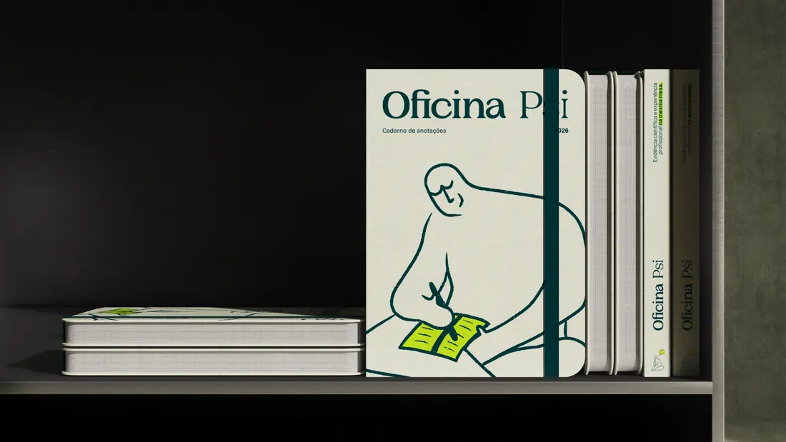
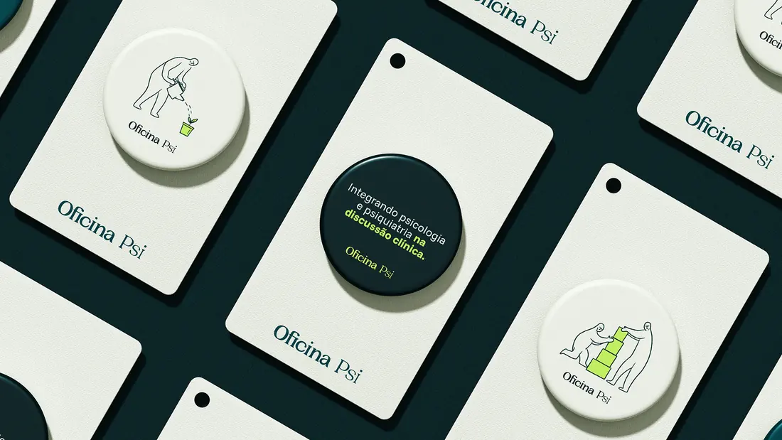
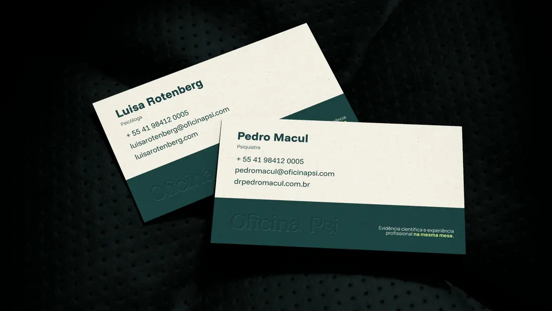
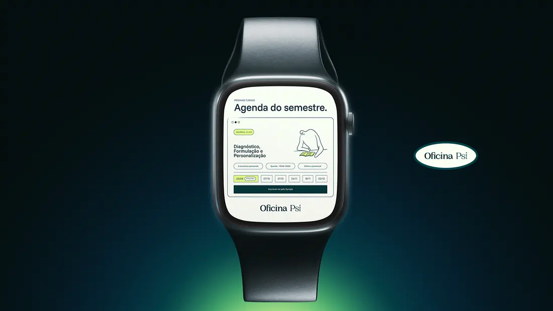
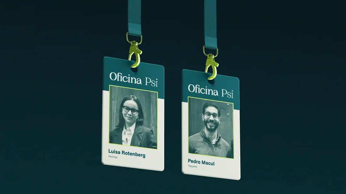
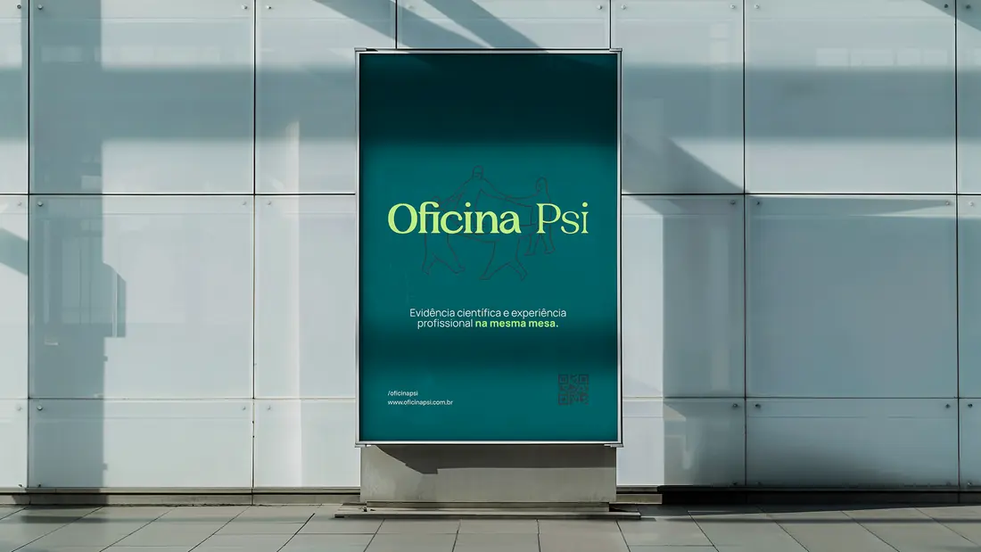
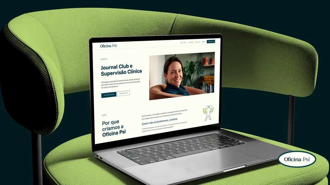
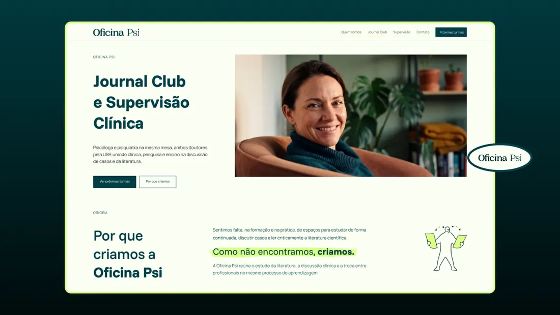
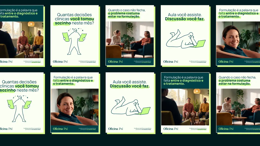
The identity is written, not drawn. The logotype sets the full name in Fraunces, a high-contrast serif carrying the weight of printed scientific text, with rounded terminals that keep it from reading as an institutional seal. Cream and deep petrol build the reading field, while green works as a gesture rather than a background: a hand-drawn highlight marking the core of a sentence, the way anyone marks a paper they are reading closely. Type, color and image all resolve into the same act of study.
Development
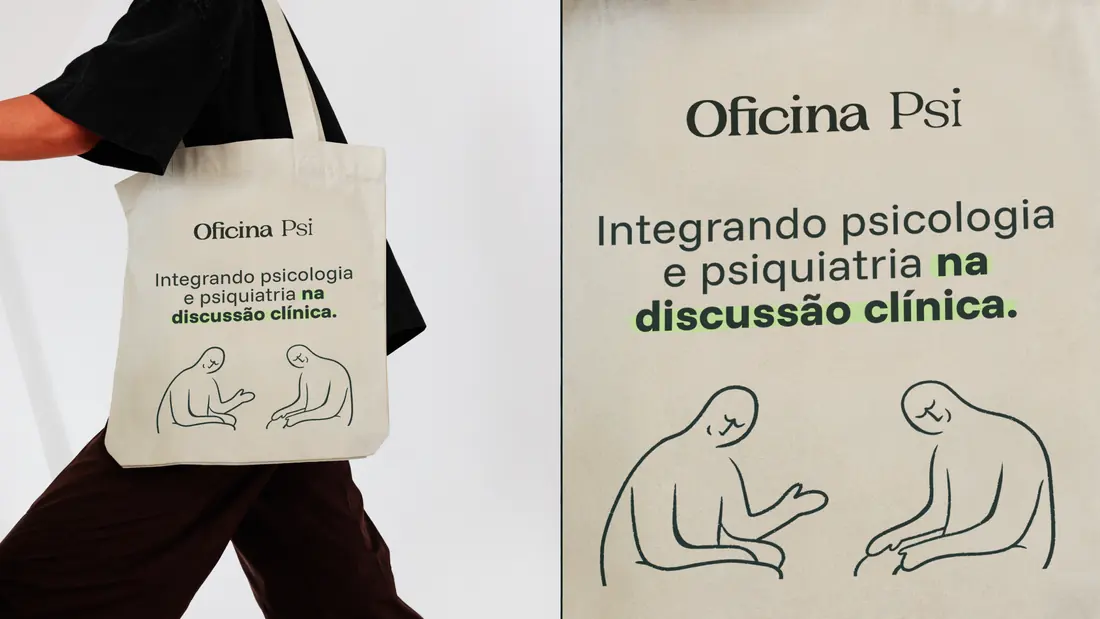
The system was built to survive one strict rule: the brand never publishes clinical cases, not even anonymized. That constraint produced two original assets. An illustrated character, hand-drawn and abstract enough to stand for no one, carrying listening and doubt without exposing a person. And an original photographic library, generated from ten directions written as cinematography briefs, specifying camera, lens, color temperature and film stock. From there came a 59-page presentation, a seven-section manual, 36 brand lines and the website.
Concept
In training, psychology and psychiatry study the same patient in separate rooms. In practice, the patient is one. That observation became the brand. The name says the rest: Oficina means workshop, a place of tools and actions, chosen against pre-chewed knowledge and the magic promise. So there is no symbol, no stylized brain, no knot coming undone. Only a name set with care, a green mark on what matters, and a signature that holds the whole idea: two readings of the same case.
More works
Based in BrasilCuritiba

MultidisciplinaryDesigner
I'm open to senior design roles on distributed teams, and to selected brand projects through Studio Cage.
The fastest way to reach me is email.