
7350 · Visual Identity
Nex House
- Year
- 2025
- Client
- Nex
- Category
- Visual Identity
- Project duration
- 8-10 Weeks
Project overview
An identity for everything beyond the workspace.
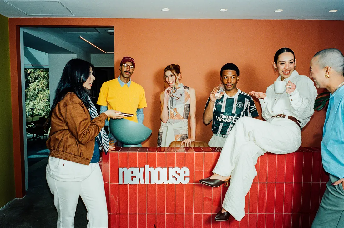
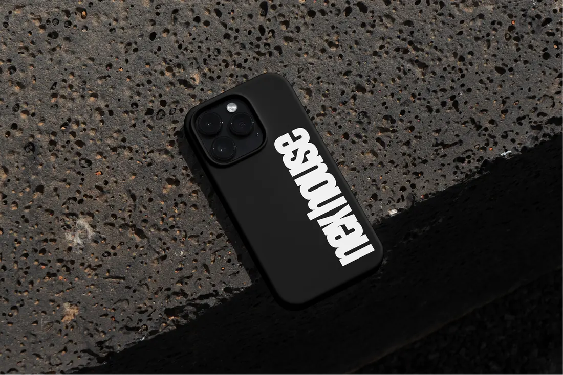
Nex House needed a brand that expressed more than desks and meeting rooms. An ultra-condensed wordmark and a visual system built around encounters give its mix of workspace, culture and community a coherent expression. Verbal identity was written with criatexto.
- Industry
- Coworking and culture
- Project focus
- Positioning and visual identity
What the project brings together
- A positioning that connects workspace, culture and community.
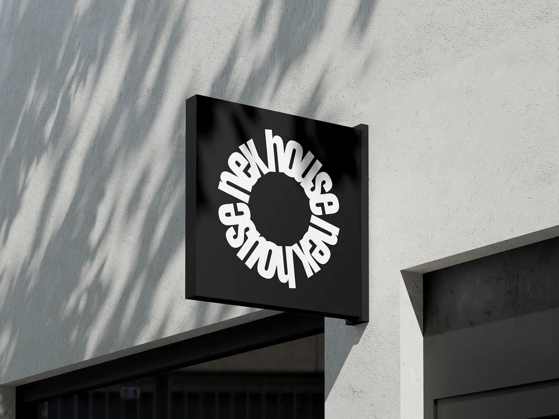
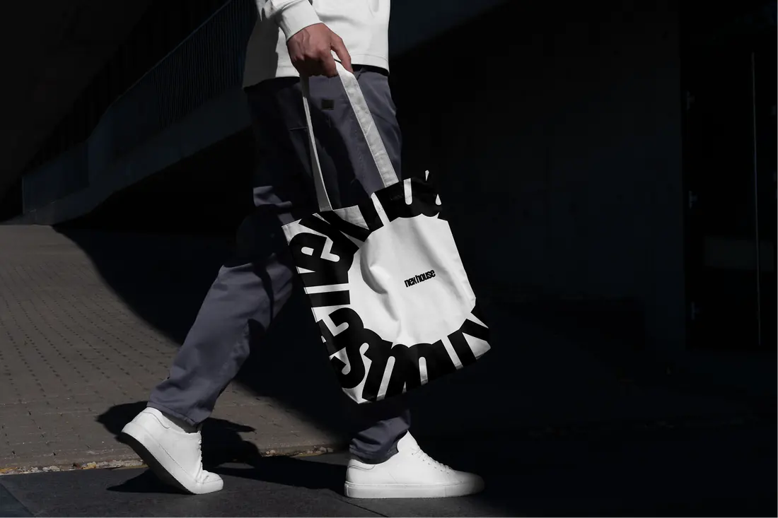
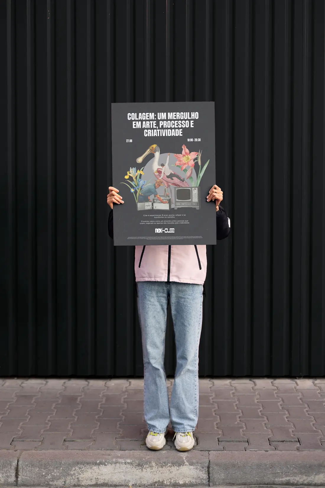
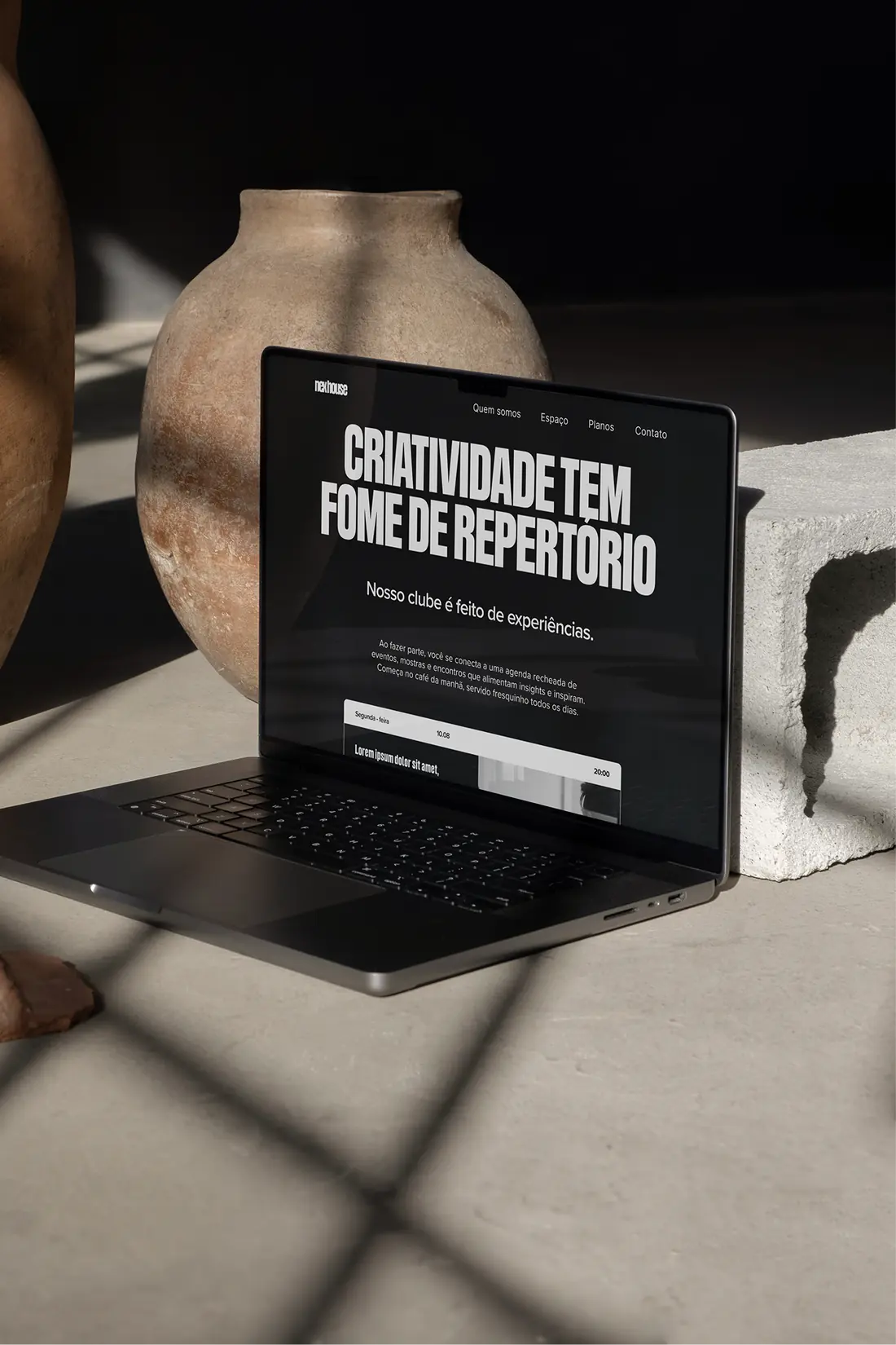
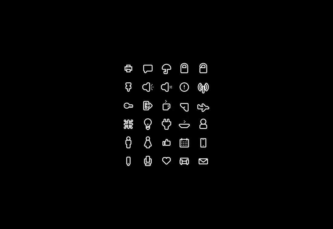
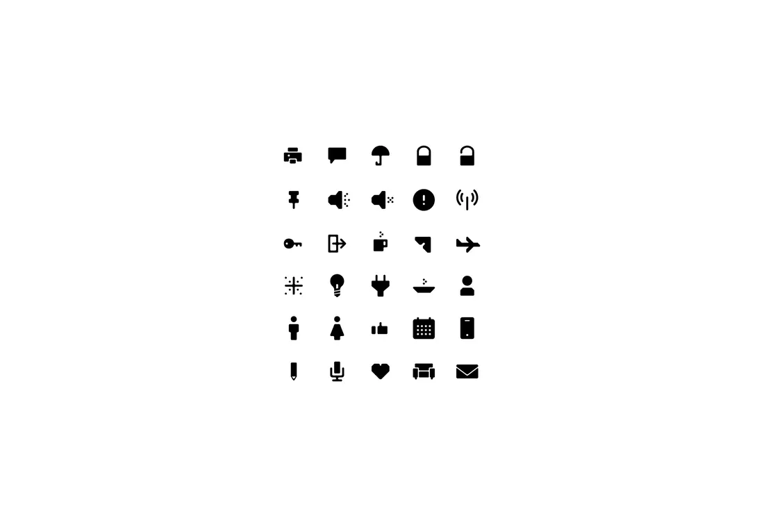
- A typographic identity designed to move from facade signage to small digital applications.
- A brand guide connecting essence, positioning and tagline, with verbal identity written with criatexto.
Research
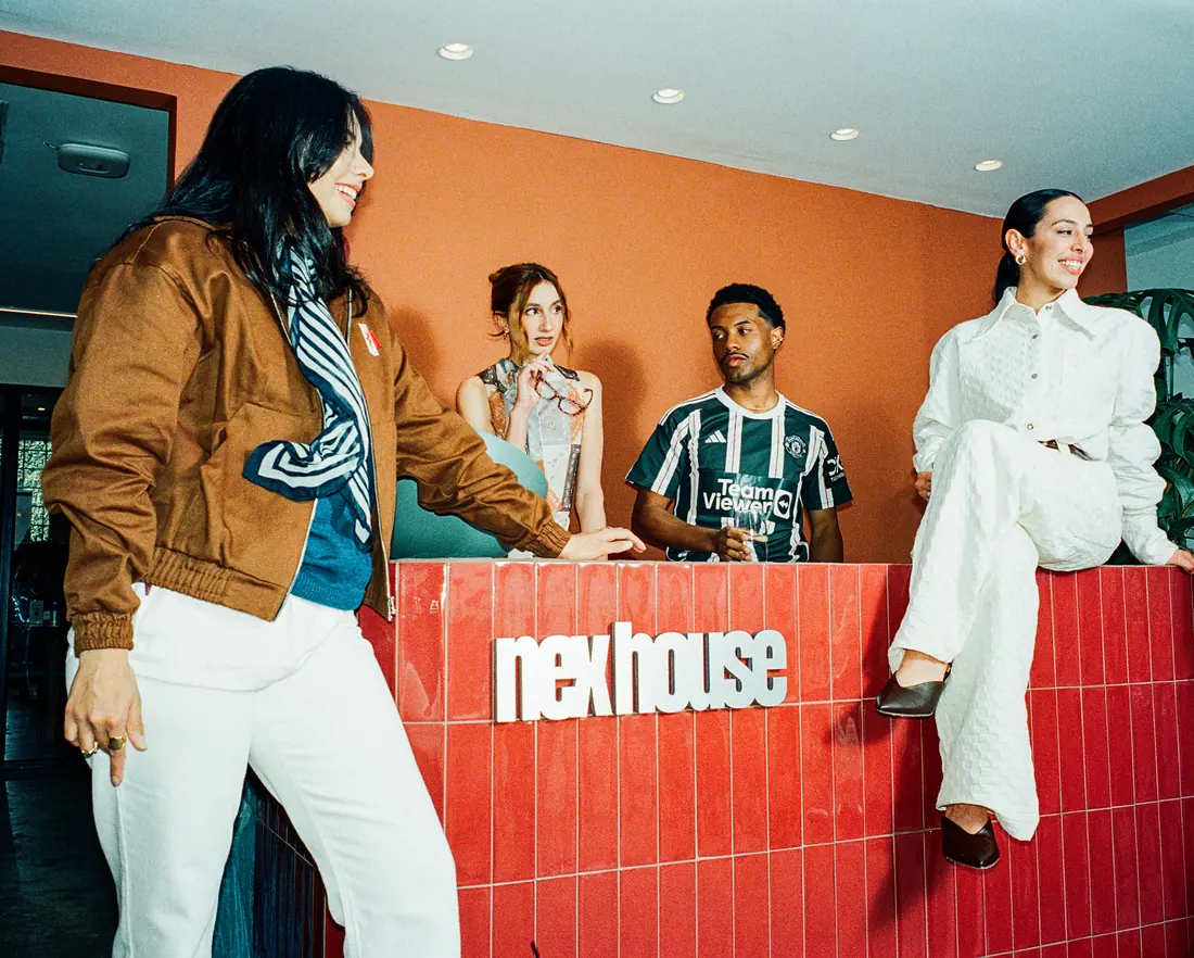
Nex had spent fifteen years turning historic mansions in the city into offices — and, along the way, into spaces for art, design, ideas and culture. The problem was that the category could only name the first half. Coworking is sold by the square metre: desks, rooms, hours. What actually kept people there was everything the contract does not list. Mapping the audience gave us a specific reader of the world — people who photograph packaging at the supermarket, notice the grout in a bathroom, pause a film to write down a line. For them, a desk is the least of it.
Design
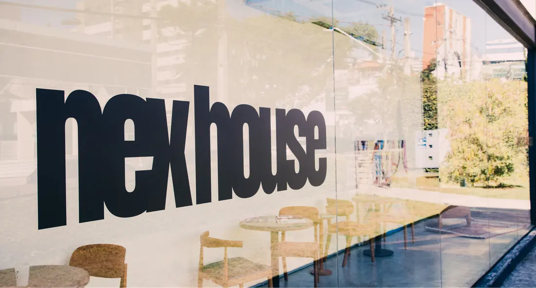
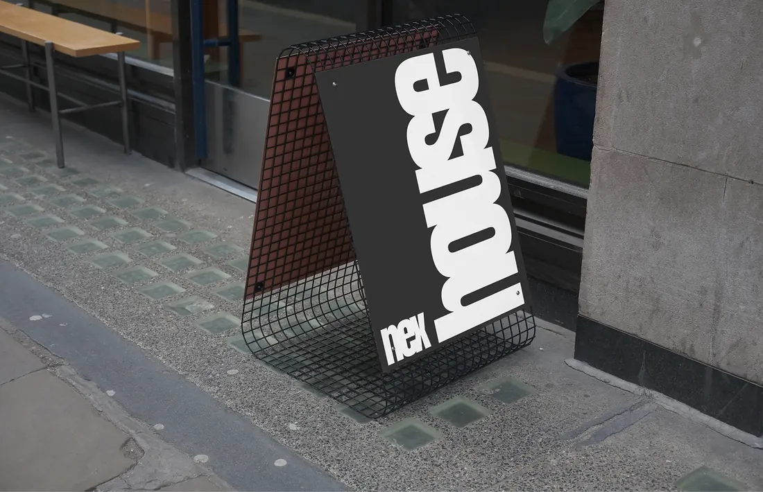
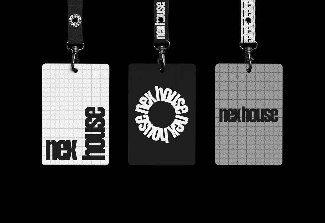
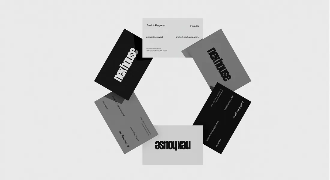
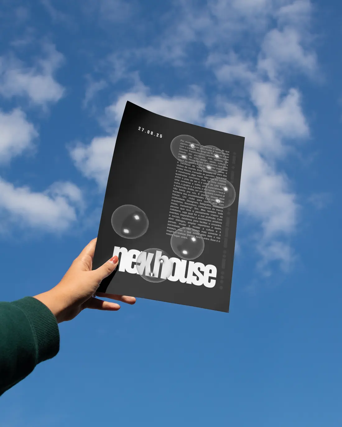
The identity is a single word set as one block. nexhouse runs in an ultra-condensed grotesque with the letterforms pushed until they touch and share edges, the x locking into the h, counters closing to slivers. There is no symbol and no shield: the brand presents itself typographically, with variable extensions always derived from the type itself, never distorted. That was the condition for it to hold at every size, from a façade sign to a footer. The compression is the argument. What binds the mark is the pressure between letters, not the space around them.
Development
The system was built around one word the strategy kept returning to: entre — between. It had to work as a position, not a decoration. So the guide separates the three things the old category had collapsed into one: the essence, that nothing emerges from emptiness and everything is born of the encounter; the positioning, a contemporary club for people who think between; and the tagline, Tudo além do espaço, everything beyond the space. The tagline is then read three times, one emphasis at a time, so any third of it can carry the brand on its own. Verbal identity written with criatexto.
Concept
Fifteen years taught Nex one thing: no idea emerges from a vacuum. It comes from the improbable and inevitable crossing of stories, talents and worldviews — and that crossing was never held by the walls. It sits in the position of the furniture and the taste of the coffee, between one conversation and the next, between one discipline and another, between the garden and the door. So being a collective office stopped being enough. Nex House is the space and everything that happens inside and outside it. Inside, outside, and between. Between is the address.

Services for a similar brief
Building a workspace or community brand?
Share your business, what you need and your target date. We can discuss an independent project or a collaboration through Studio Cage.
More works
Based in BrasilCuritiba


MultidisciplinaryDesigner
Available for independent brand and web design projects, senior design roles on distributed teams, and collaborations through Studio Cage.
The fastest way to reach me is email.