
2694 · Visual Identity
Helicônia Hotel Design
A sanctuary where nature, design, and exclusivity thrive in harmony.
- Year
- 2024
- Client
- Helicônia Hotel Design
- Category
- Visual Identity
- Project duration
- 8-10 Weeks
Project overview
Hotel branding rooted in the natural world.
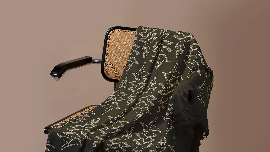
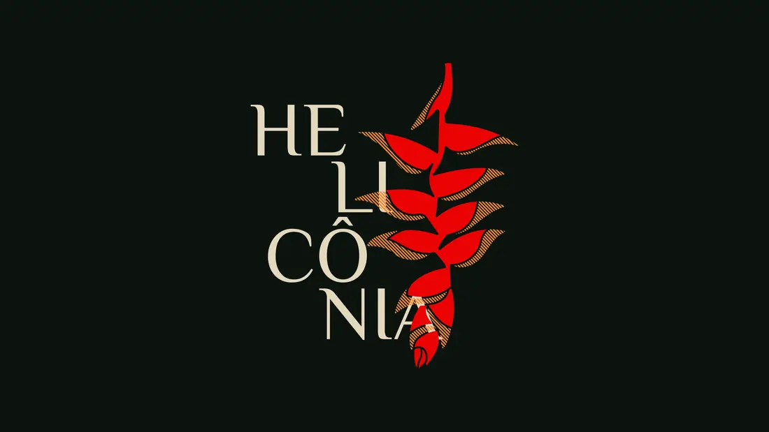
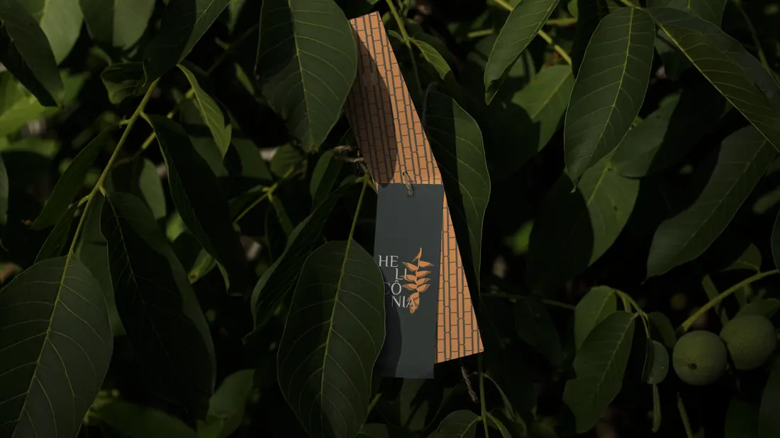
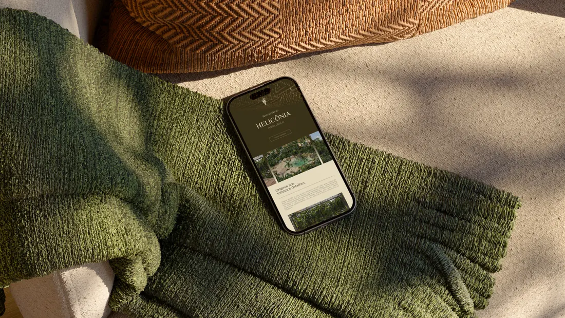
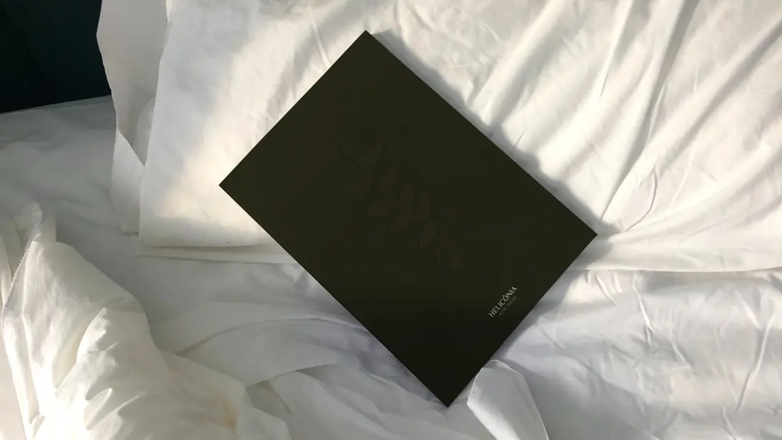
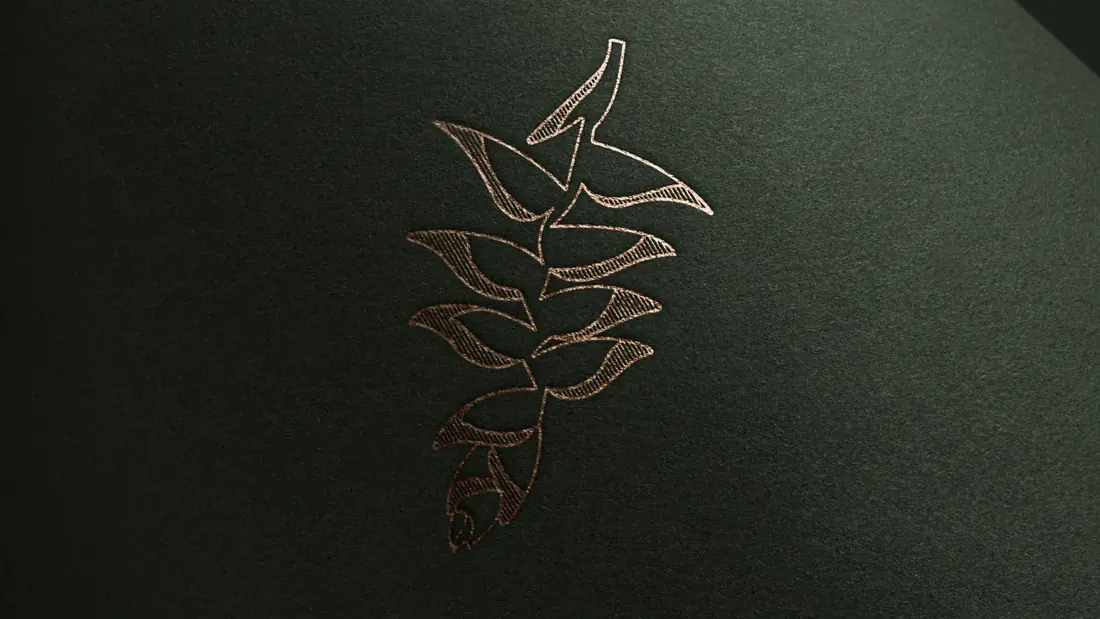
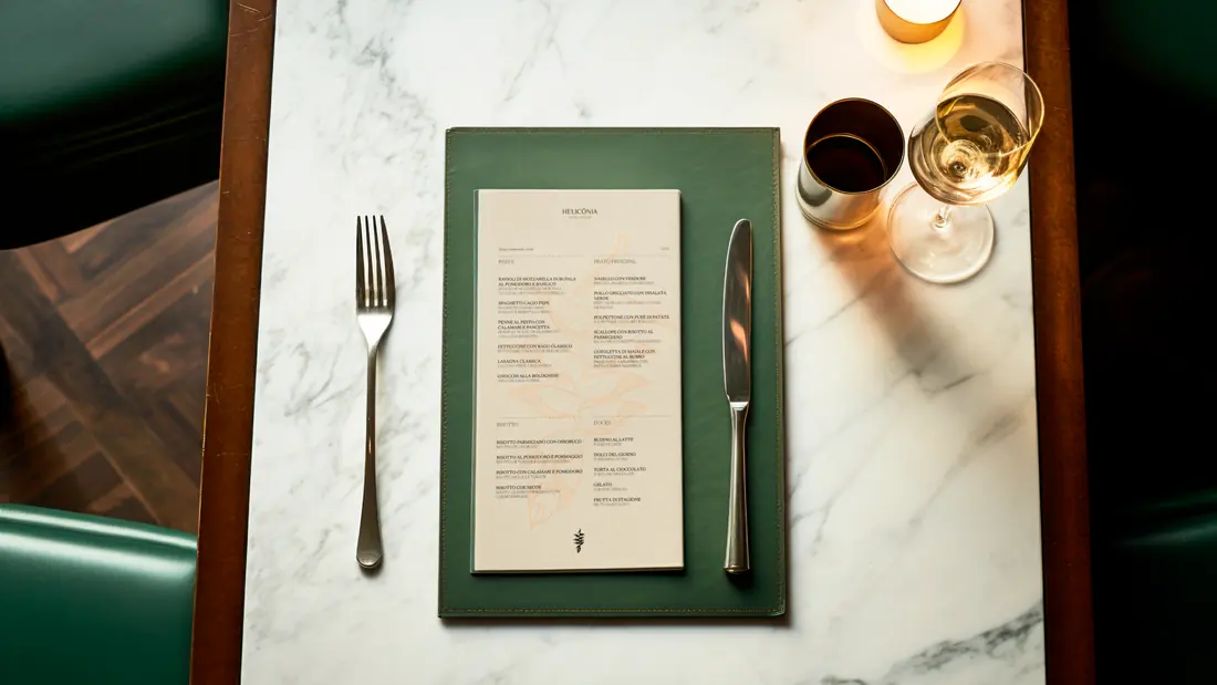
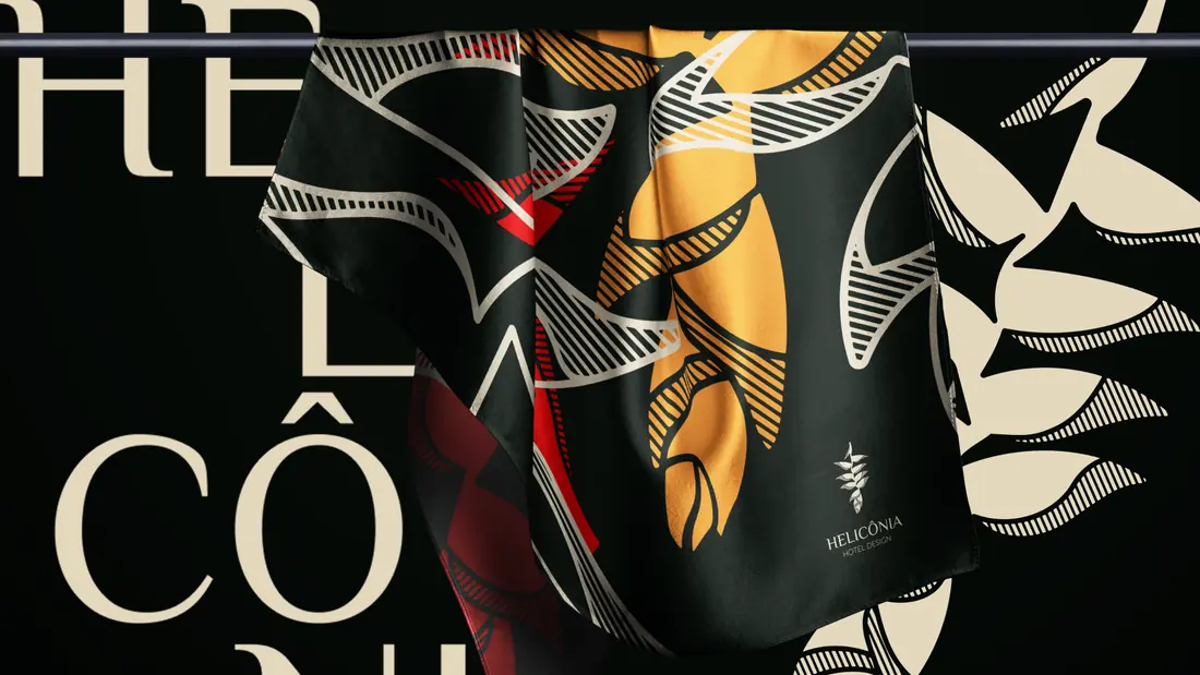
The Helicônia flower provided the starting point for a hospitality identity shaped by nature, serenity and design. Typography, an earthy palette and botanical patterns connect the brand across signage, guest touchpoints and digital applications.
- Industry
- Hospitality
- Project focus
- Visual identity and brand applications
Research
Our research began with the Heliconia Rostrata itself — a plant native to tropical regions, known for its vibrant form and symbolic resilience. From this starting point, we explored the intersection of biophilic design, sustainability, and luxury hospitality, drawing insights from high-end eco-resorts, architectural principles grounded in nature, and the expectations of a discerning, experience-driven clientele. These findings helped define the emotional and functional pillars of the brand: connection, sophistication, and natural elegance.
Design
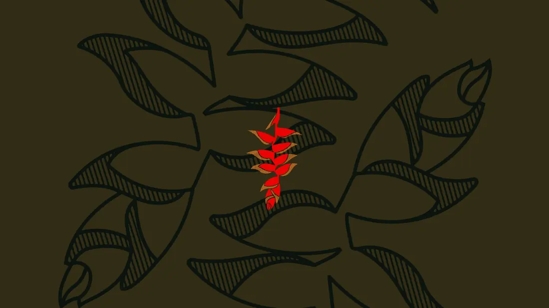
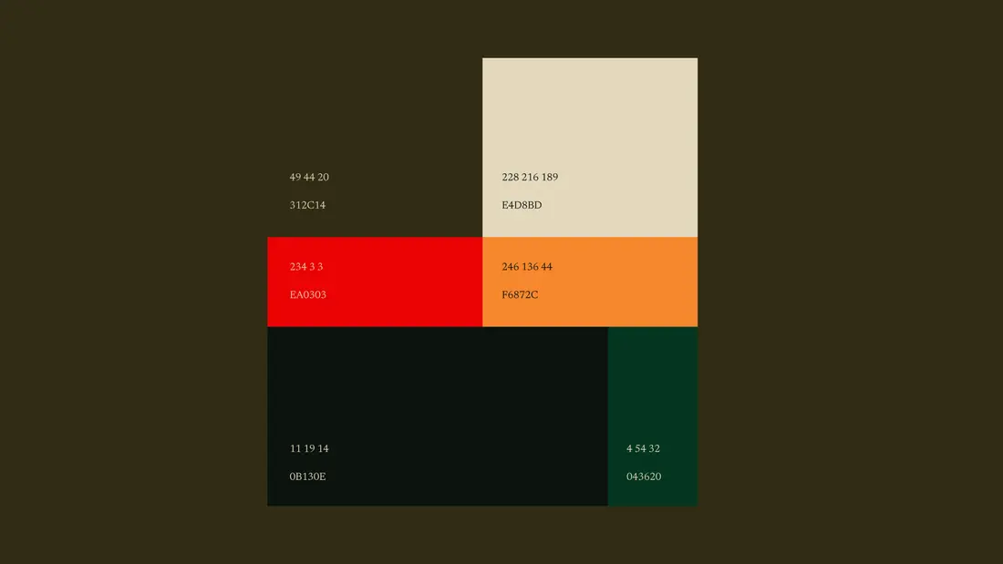
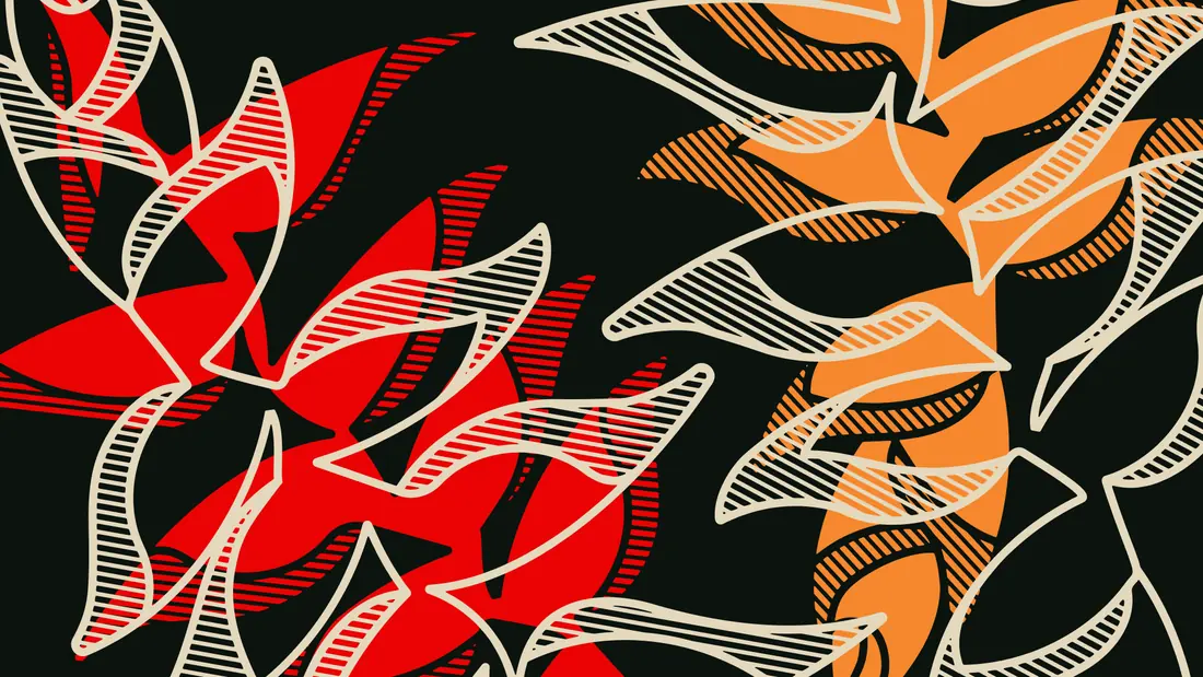
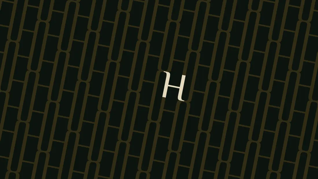
The visual identity pays tribute to the organic beauty of the Heliconia flower, translated into a refined, modern design system. We developed a color palette rooted in the earth — deep greens, warm neutrals, and muted reds — echoing the richness of the surrounding environment. The typography features fluid, natural curves, emulating the movement of leaves in the wind, while bespoke graphic patterns mirror the plant’s structure, bringing subtle botanical geometry into the brand’s visual language.
Development
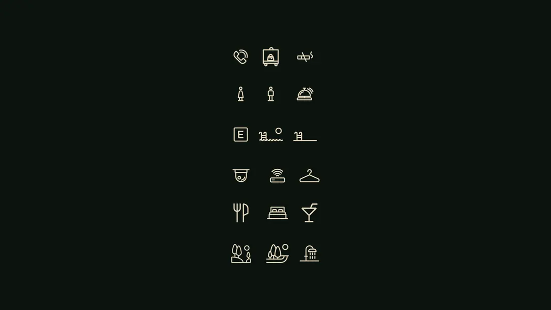
The design process was immersive and detail-oriented. We began by defining brand values through a collaborative workshop with the client, aligning on the themes of reconnection, exclusivity, and sustainability. From there, we built a visual system that could stretch from architectural applications (like signage, wayfinding, and in-room experiences) to digital expressions (such as the website and marketing materials). Prototyping and testing ensured that each element not only looked beautiful but functioned cohesively across mediums and touchpoints.
Concept
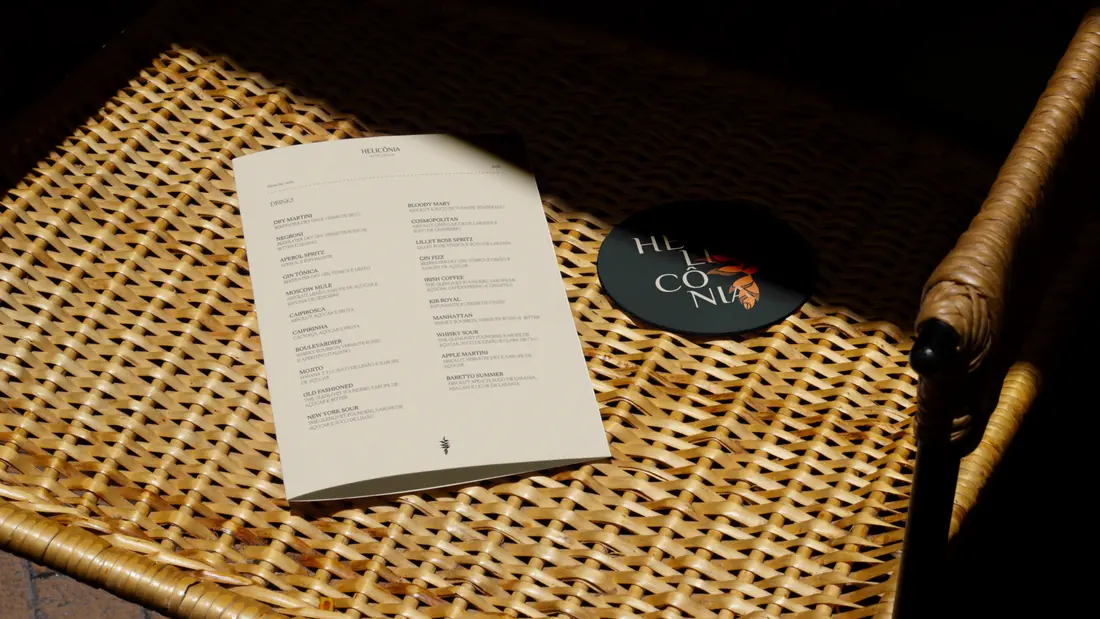
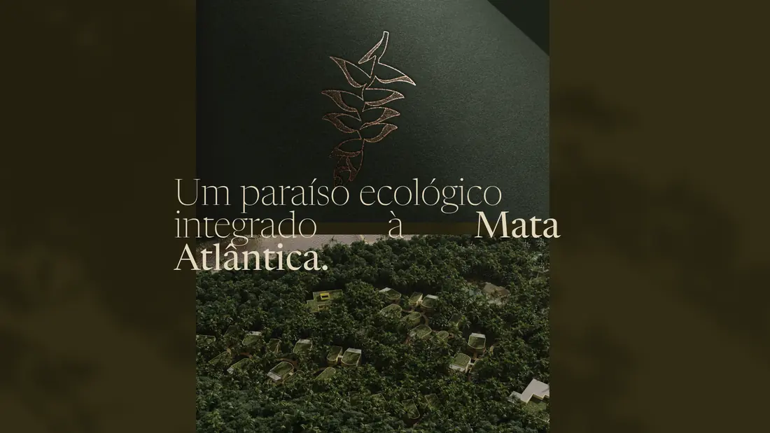
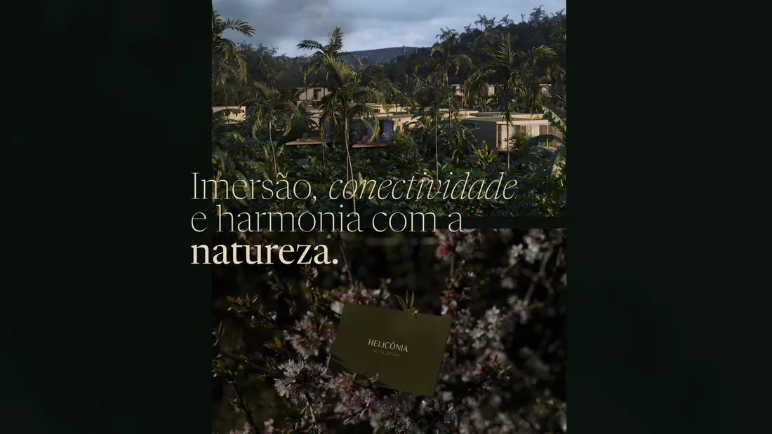
The final identity positions Heliconia as more than a hotel — it’s a designed experience of immersion in nature. Every visual element supports this idea, offering guests a sense of serenity, discovery, and luxury rooted in the organic world. The result is a brand that doesn’t just talk about sustainability and design — it lives it, from the typography to the textures.
Heliconia is an invitation to pause, reconnect, and be transformed by the beauty of intentional design in harmony with nature.
Services for a similar brief
Planning a hotel or hospitality brand?
Share your business, what you need and your target date. We can discuss an independent project or a collaboration through Studio Cage.
More works
Based in BrasilCuritiba


MultidisciplinaryDesigner
Available for independent brand and web design projects, senior design roles on distributed teams, and collaborations through Studio Cage.
The fastest way to reach me is email.