
9186 · Visual Identity
Bloco Productions
Where corporate stories become crafted audiovisual experiences.
- Year
- 2024
- Client
- Bloco Productions
- Category
- Visual Identity
- Project duration
- 10-12 Weeks
Research
To bring BLOCO to life, we began by exploring the intersection of art and corporate communication. Our research focused on understanding how businesses perceive and use video as a strategic tool, and how creative studios can differentiate themselves in a market that often defaults to either overly technical or overly artistic extremes. We also analyzed competitors in the audiovisual space, identifying a gap for a brand that could speak both the language of business and the emotion of storytelling. This insight shaped our approach: to position BLOCO as a translator of complex ideas into visual narratives with elegance, clarity, and impact.
Design
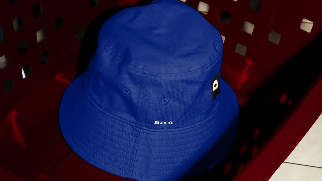
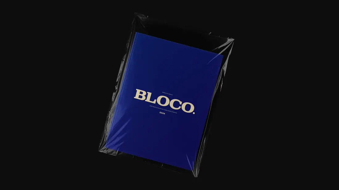
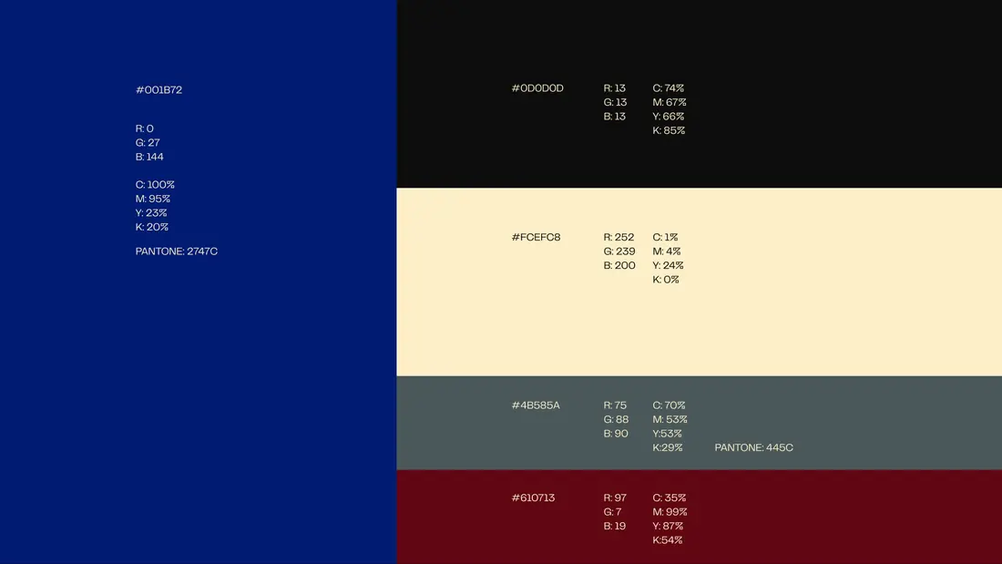
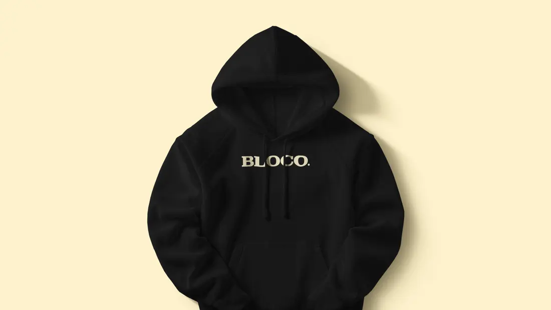
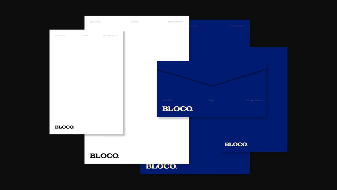
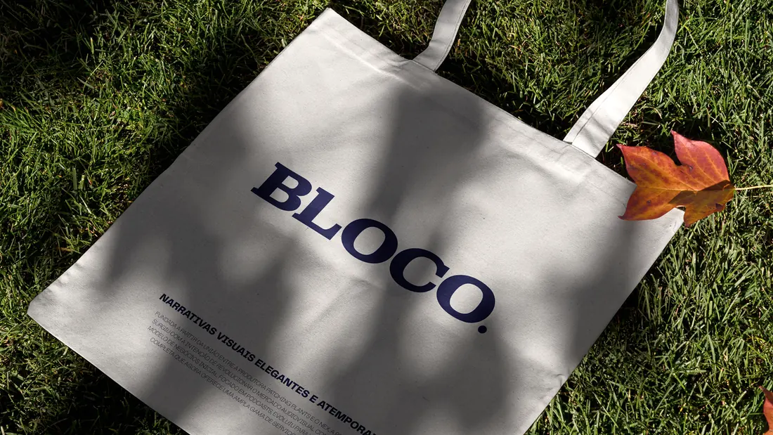
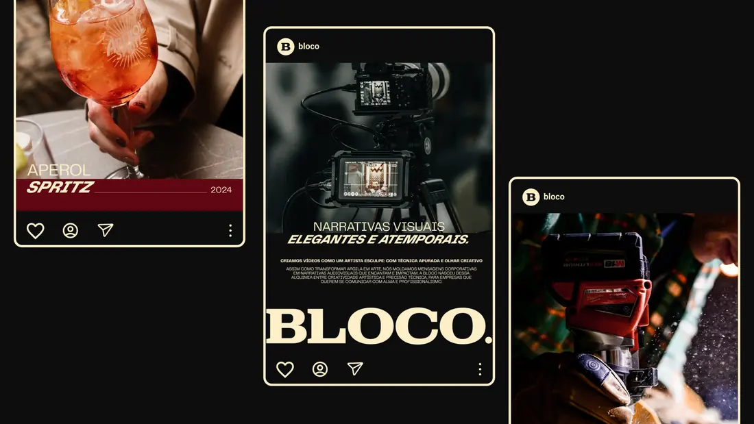
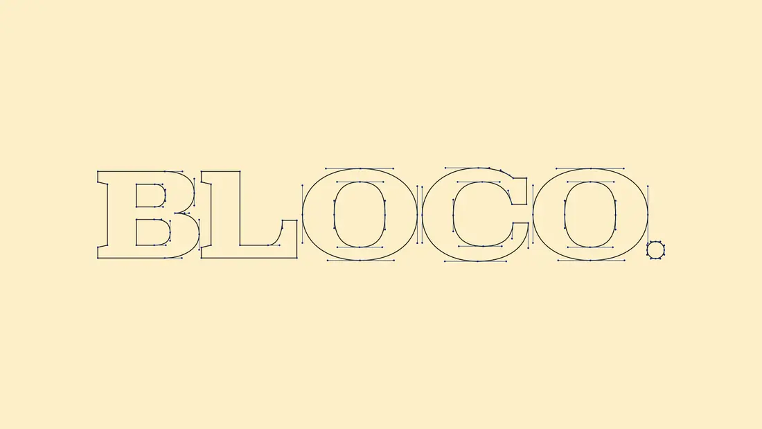
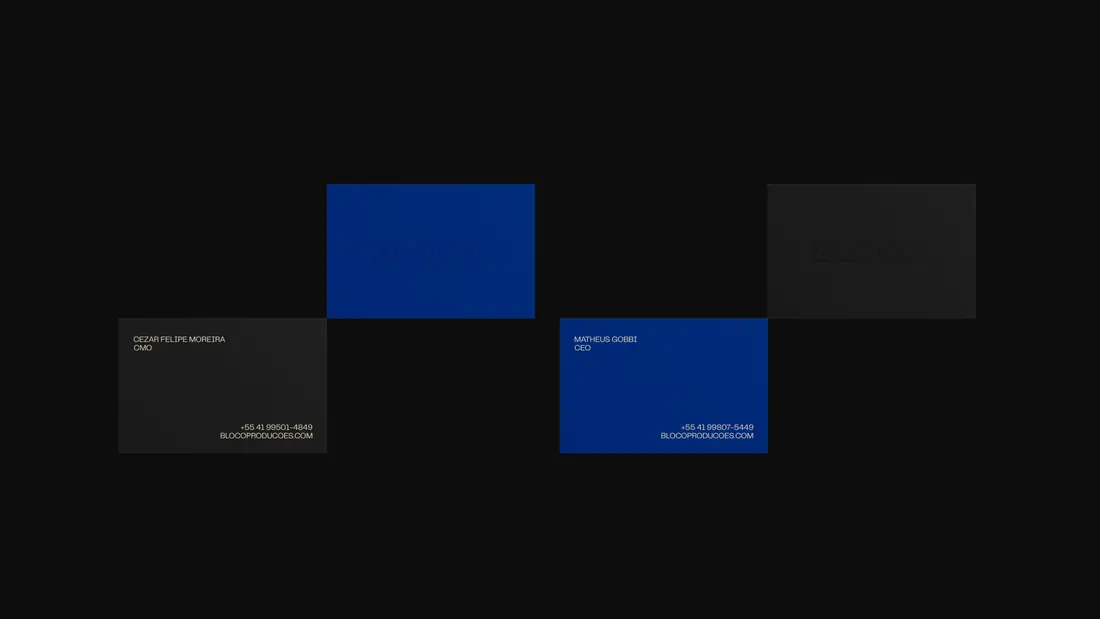
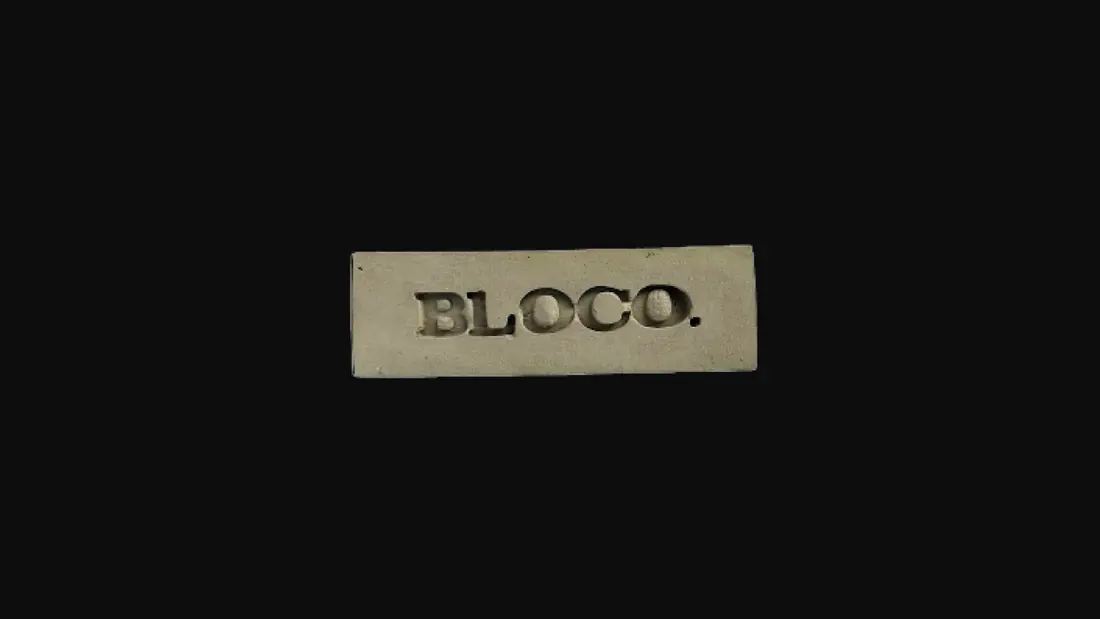
BLOCO’s identity draws directly from its name — a foundation, a building block, a medium of transformation. The custom bold-weight serif typography with square terminals anchors the visual language, expressing strength and structure. At the same time, its rounded angles introduce softness, suggesting openness and accessibility.
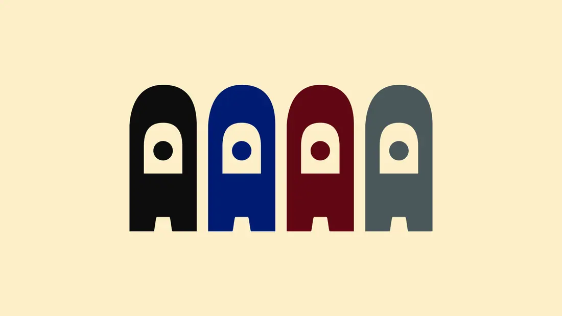
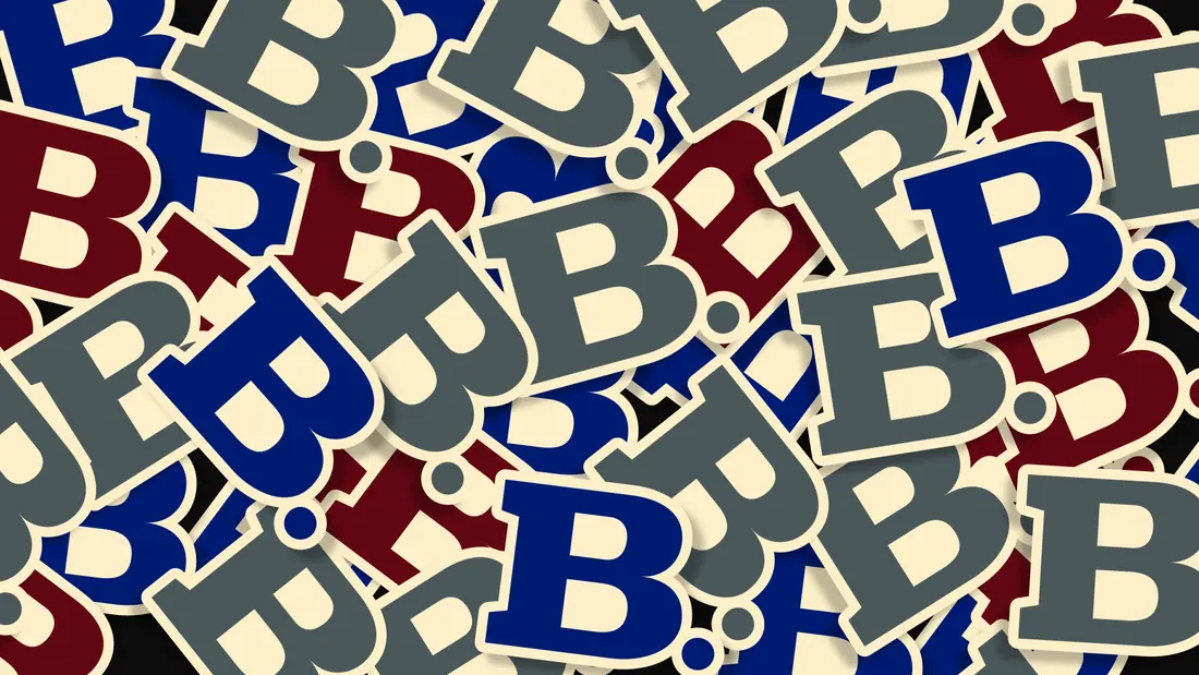
A central highlight of the identity is the mascot, crafted from the letterforms themselves. Far from a decorative element, the mascot plays an emotional and functional role — appearing in tutorials, onboarding, and case studies to bring warmth and personality to the brand. This duality — bold yet friendly, technical yet human — defines BLOCO’s visual voice.
Development
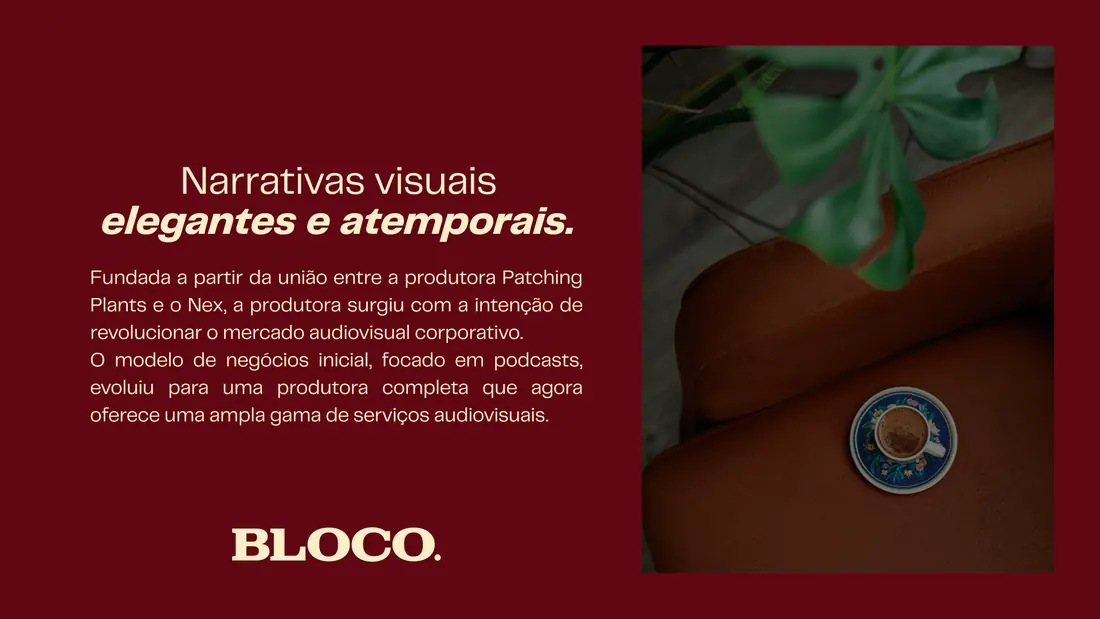
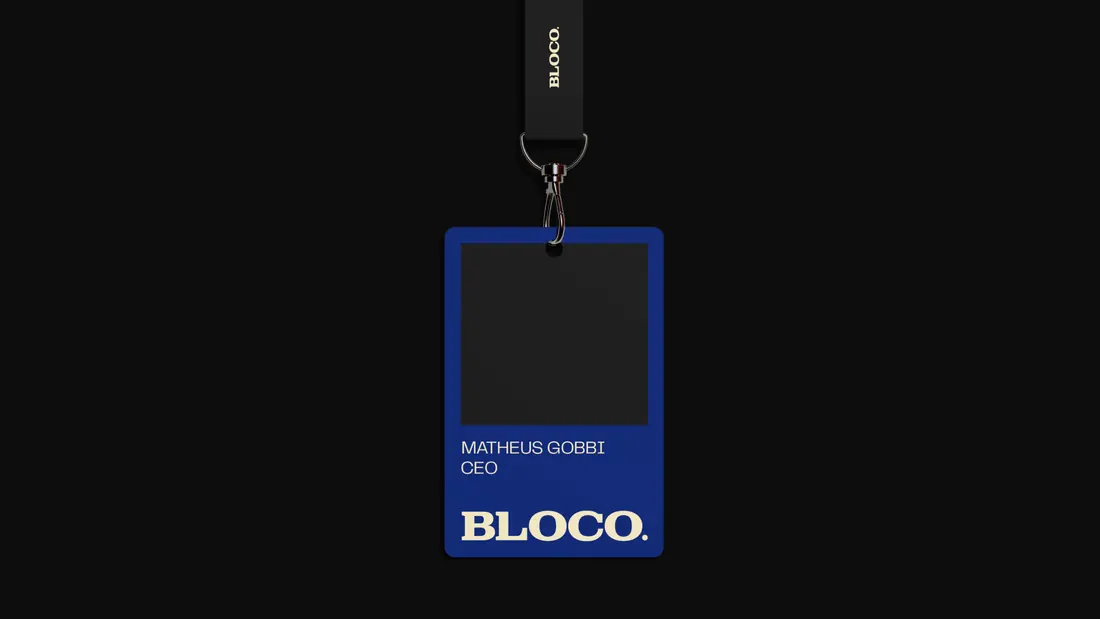
The development process was highly collaborative and iterative, with a strong focus on visual clarity and brand flexibility. We began by deconstructing the brand name and values into core attributes: reliability, creativity, elegance, and transformation. From there, we explored type construction techniques that could bridge corporate gravitas with creative flair. The mascot was born out of experimentation — a form extracted from the logotype that evolved into a character capable of storytelling and engagement. All brand elements were designed to function across a wide range of applications, from high-end video reels to educational content.
Concept
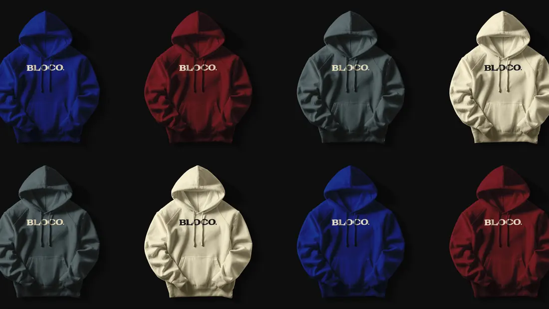
BLOCO’s final identity is a visual metaphor for transformation. It captures the studio’s mission: to take raw information and sculpt it into something memorable, strategic, and artistic. The brand system balances bold typography with emotional intelligence, formal rigor with imaginative play. In every expression, BLOCO proves that even the most technical narratives can be deeply human and that design, when crafted with purpose, has the power to move people and messages alike.
More works
Based in BrasilCuritiba


MultidisciplinaryDesigner
I'm open to senior design roles on distributed teams, and to selected brand projects through Studio Cage.
The fastest way to reach me is email.