
6072 · Visual Identity
Arví
A place where nature and community find harmony.
- Year
- 2023
- Client
- Montipê
- Category
- Visual Identity
- Project duration
- 6-8 Weeks
Project overview
A real estate identity shaped by place and community.
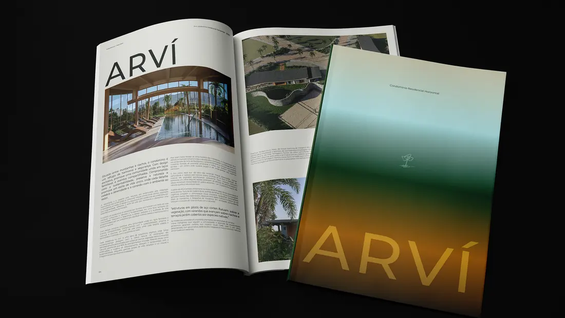
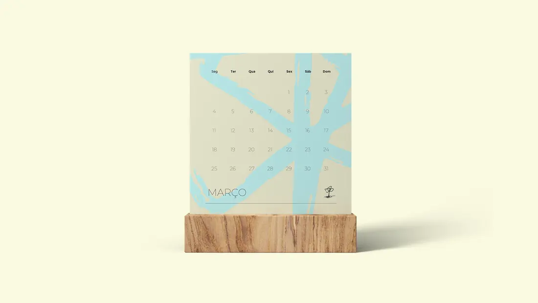
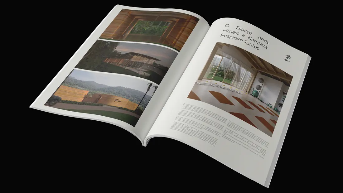
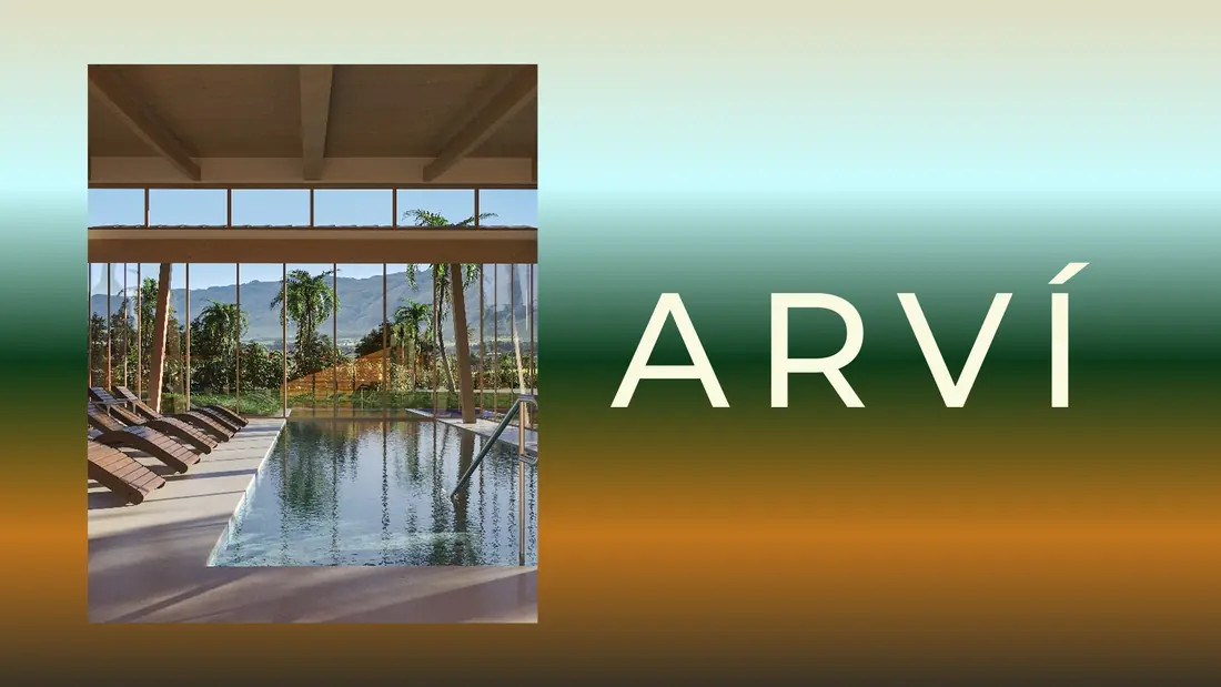
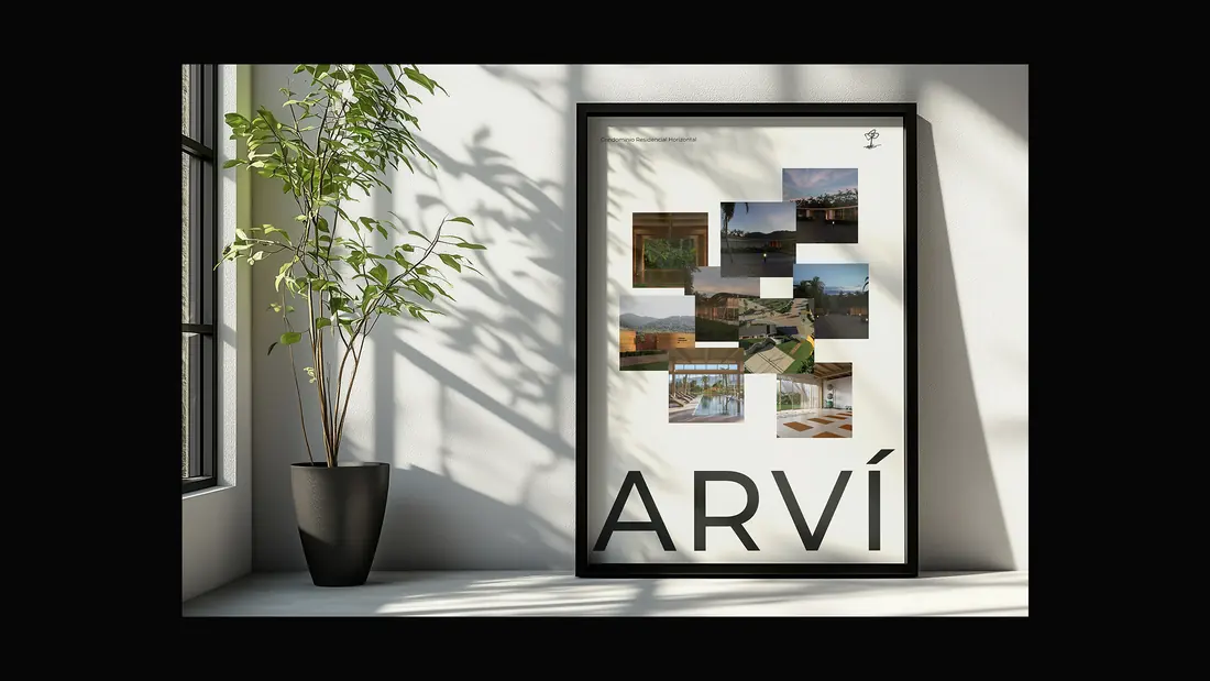
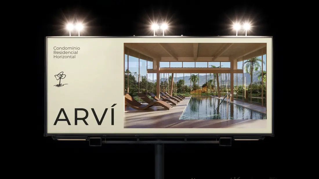
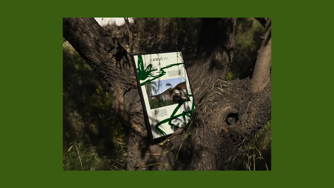
Arví needed to express the experience of living close to nature, rather than simply describe a residential development. An organic symbol, restrained typography and an earthy palette carry that idea across signage and digital communication.
- Industry
- Residential real estate
- Project focus
- Visual identity and brand applications
Research
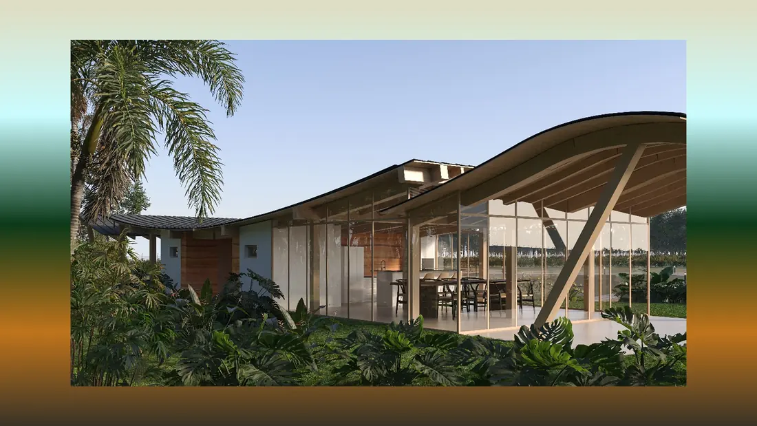
To begin the Arví project, we immersed ourselves in the geographic, emotional, and cultural context of the development. Located between mountains and streams, Arví is more than a residential complex — it’s a sanctuary rooted in nature, well-being, and family life. Our research focused on understanding the aspirations of potential residents and the emotional value of living in close connection with the environment. We explored how residential developments across Latin America communicate sustainability and community, and we collaborated directly with the client to define the emotional tone the brand should carry: serenity, warmth, and belonging.
Design
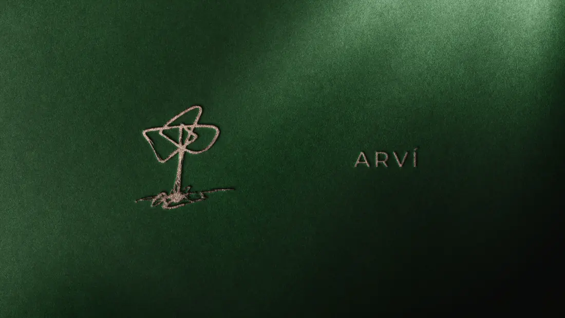
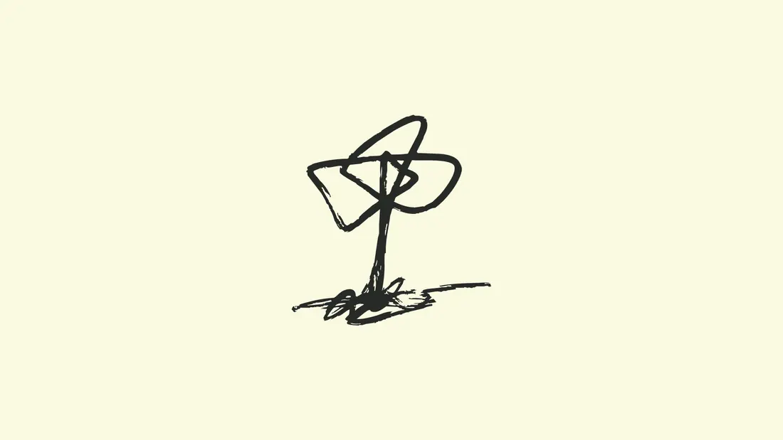
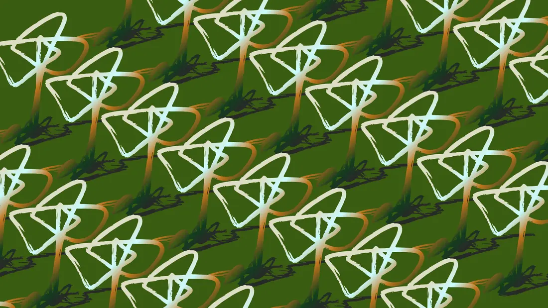
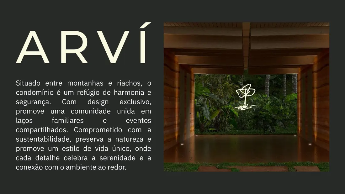
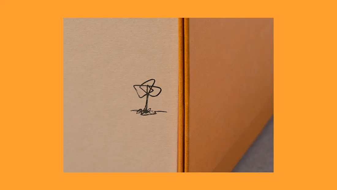
The Arví visual identity is a balance between simplicity and emotional resonance. At its core is a symbolic icon, co-created with the client, that encapsulates the core values of the project — nature, protection, and connection. The symbol feels organic and intentional, echoing the flowing landscapes that surround the development. Paired with a minimalist typeface, the identity achieves both elegance and clarity, ensuring it speaks to future residents with authenticity and trust. A natural, earthy color palette reinforces the project’s harmony with the environment and communicates its sustainable ethos.

Development
The design process was deeply collaborative, with multiple workshops and creative sessions to capture the emotional essence of the brand. Rather than designing in isolation, we involved the client in early conceptual stages — using visual moodboards, symbolic sketches, and keyword associations to align the creative direction. Once the icon emerged, we refined it with care to ensure it could function at every scale, from signage to social media. Every design element was tested in realistic environments to guarantee coherence and impact across touchpoints.
Concept
The final identity for Arví is a calm yet powerful representation of place and purpose. It reflects a lifestyle rooted in community, nature, and sustainability, inviting future residents to embrace a slower, more connected way of living. The emblematic icon is both a symbol and a story — a reminder of the values that shape the project. The overall identity positions Arví as a contemporary refuge, where design supports not just aesthetics, but emotional and environmental well-being.
Services for a similar brief
Planning a real estate or residential brand?
Share your business, what you need and your target date. We can discuss an independent project or a collaboration through Studio Cage.
More works
Based in BrasilCuritiba
MultidisciplinaryDesigner
Available for independent brand and web design projects, senior design roles on distributed teams, and collaborations through Studio Cage.
The fastest way to reach me is email.