
5261 · Visual Identity
Montipê Architecture
Where bold design meets visionary development.
- Year
- 2023
- Client
- Montipê
- Category
- Visual Identity
- Project duration
- 3-4 Weeks
Project overview
One identity for architecture and real estate development.
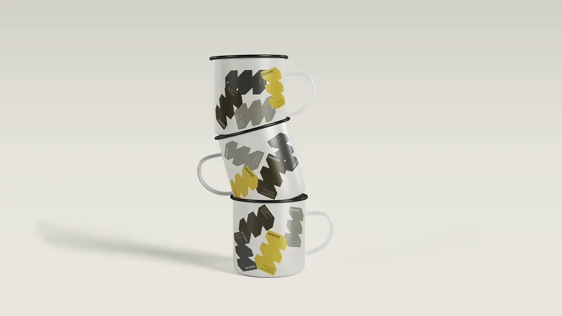
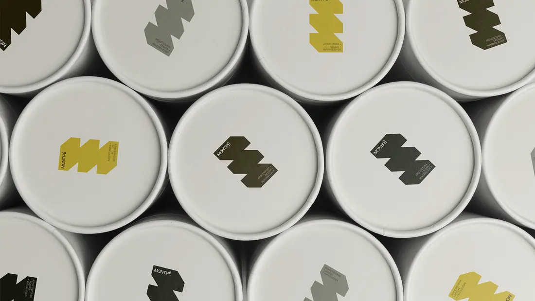
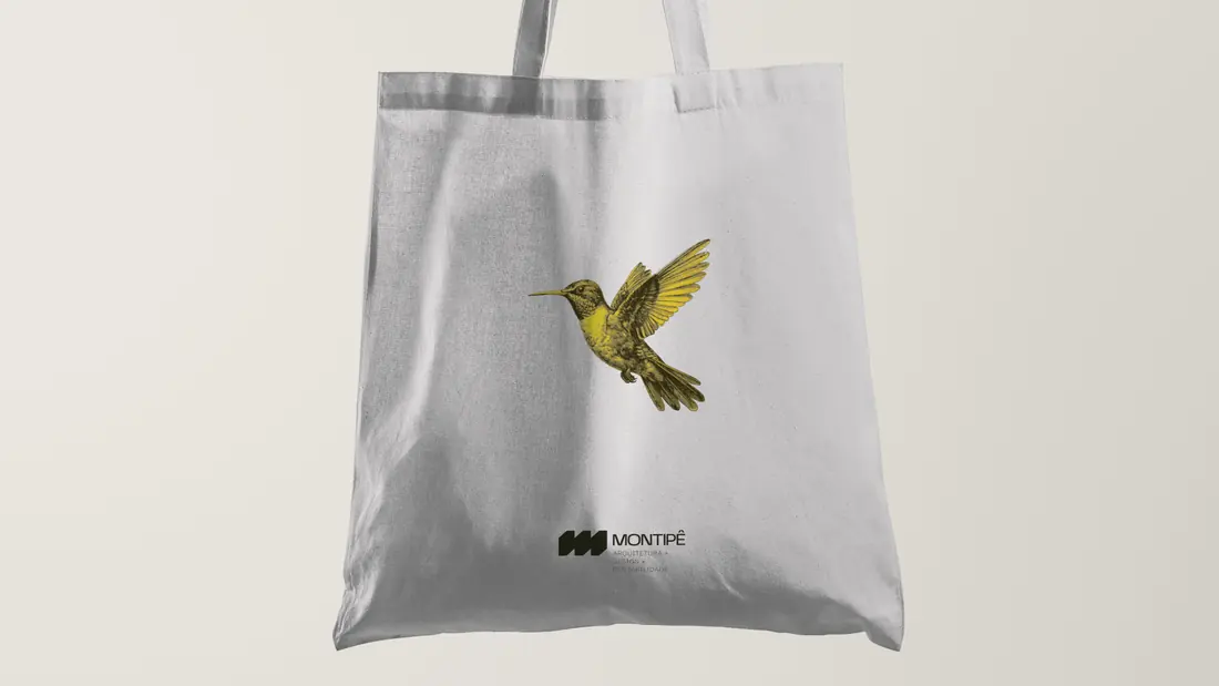
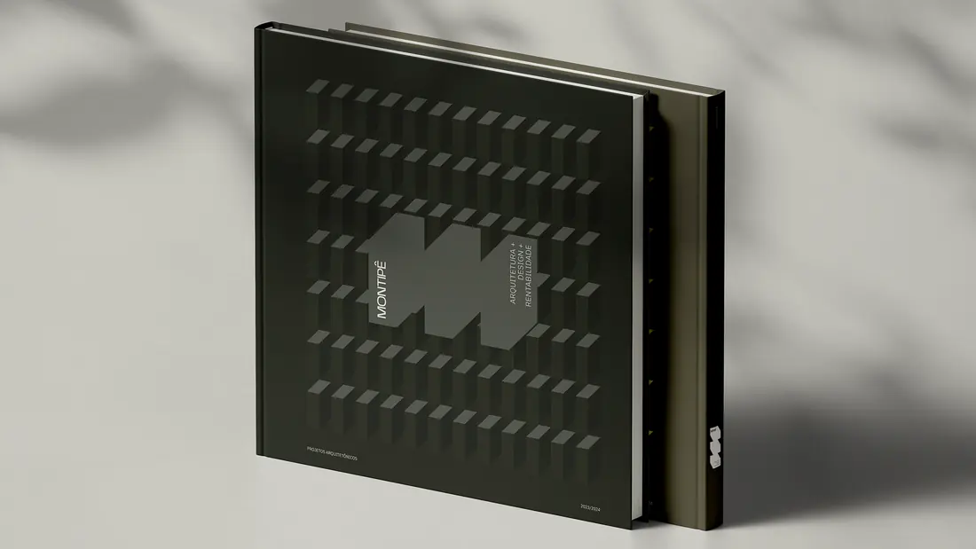
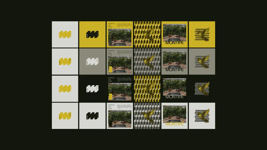
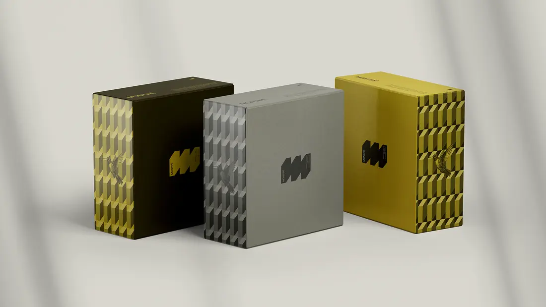
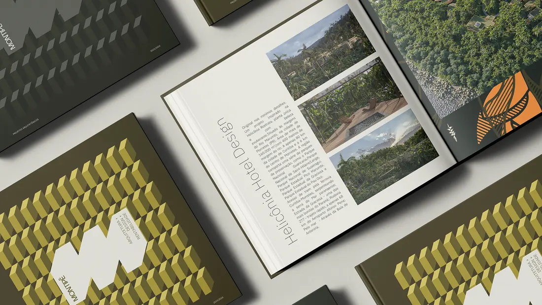
Montipê operates across architectural design and property development. A unified symbol and a flexible system of typography, layouts and colour connect these two sides across print, digital, signage and environmental applications.
- Industry
- Architecture and real estate
- Project focus
- Visual identity and brand applications
Research
The Montipê project began with a deep dive into the brand’s unique duality: as both an architecture studio and a real estate developer. Our research focused on how to bridge these two worlds through a unified identity — one that could express the artistic ambition of architecture and the strategic, results-driven mindset of development. We studied local references, explored the influence of Brazilian culture on contemporary design, and benchmarked how other ESG-driven companies were communicating sustainability, exclusivity, and innovation. This process allowed us to define key positioning pillars: impactful design, financial performance, cultural relevance, and environmental responsibility.
Design
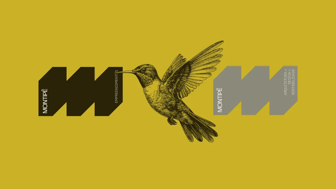
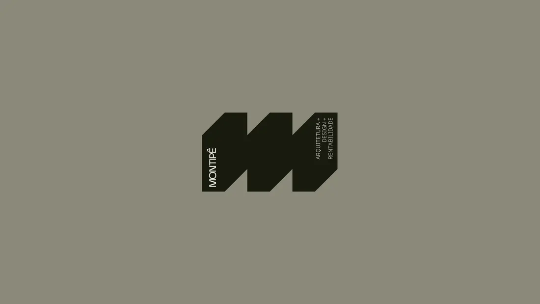
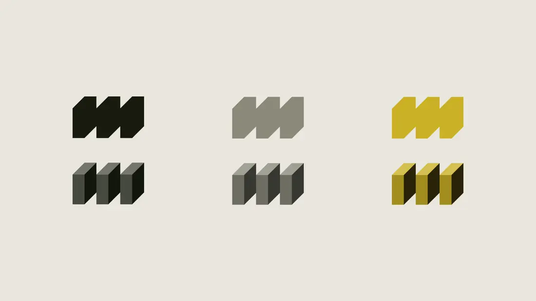
The visual identity of Montipê was created to reflect a brand that is plural, energetic, and refined. At its core is a minimalist symbol — a single, continuous line forming the letter “M.” This line represents fluidity, connection, and unity, visually merging Montipê’s two business areas into one coherent signature. The typography is bold yet elegant, reinforcing the brand’s contemporary and authoritative presence. A vibrant but carefully curated color palette supports the dual tone of the business: creative yet strategic, expressive yet reliable.
Development
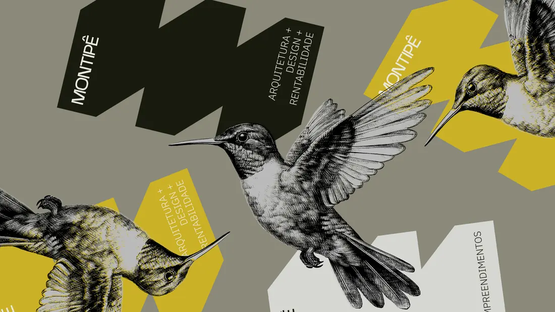
The creative process focused on finding the perfect balance between aesthetic sophistication and functional clarity. We explored several visual routes before defining a direction that honored both the expressive nature of architectural design and the trustworthiness needed in real estate development. Prototyping the symbol involved simplifying forms while maintaining distinctiveness — ultimately arriving at a mark that is both dynamic and timeless. We also created a flexible system of layout rules, typography hierarchies, and graphic elements that allow the identity to adapt across digital, print, signage, and environmental applications.
Concept
Montipê’s final identity is a celebration of bold ideas grounded in purpose. It positions the brand as a forward-thinking force in Brazilian architecture and real estate, ready to shape spaces that are not only iconic, but also sustainable, profitable, and deeply human. The symbol — a continuous line — speaks to the seamless integration of creativity and strategy, while the overall aesthetic elevates the brand into a space of modern sophistication and lasting impact.


Services for a similar brief
Planning an architecture or property brand?
Share your business, what you need and your target date. We can discuss an independent project or a collaboration through Studio Cage.
More works

Based in BrasilCuritiba


MultidisciplinaryDesigner
Available for independent brand and web design projects, senior design roles on distributed teams, and collaborations through Studio Cage.
The fastest way to reach me is email.